Report
The Report view contains two adjoined diagrams with tables showing the resource utilization versus capacity.
When you open this view for the first time, the diagrams are black. You can assign colors to the items according to your needs.
Both diagrams follow the same structure.
The Resources diagram shows the workload per resource and the total capacity.
The Projects diagram shows the workload of the entire team per project, absences or operations, and the total capacity.
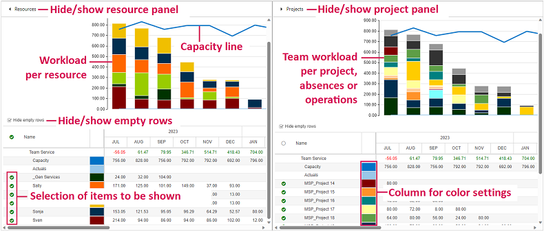
You can filter the items by selecting or deselecting the checkboxes in the tables. The diagrams will be adapted automatically to the selection.
When you hide the Resources panel, the Projects panel will expand over the whole width of the window, and vice versa.