Heatmap view options
|
Work Interface and Views > Scenario > Resource table > Heatmap view options |
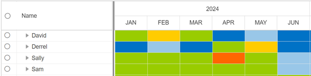
The histogram can be switched to a heatmap showing the difference between capacity and planned work of the resources by colors. The colors are displayed according to preset thresholds.
In addition, the numeric values of the difference between capacity and planned work can be shown in the chart in hours or percent.
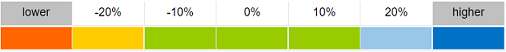
By default, yellow indicates that the resource is overloaded with more than 10% of their capacity, red indicates an overload of more than 20%.
Light and dark blue fields indicate that the resource has free capacity of more than 10% or 20% respectively.
▪To switch to the heatmap, go to the View group of the Resources tab.
▪Open the drop-down menu next to Switch View and select the desired heatmap view.
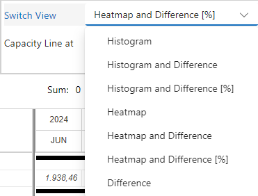
Heatmap shows the heatmap without numerical values.
Heatmap and Difference shows the heatmap with values in hours.
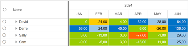
Heatmap and Difference [%] shows the heatmap with values in percent of the capacity.

If the difference between capacity and planned work is shown in the heatmap, the Difference row will not be shown in the table.