Column Configuration
|
Configure Settings for Content Pages > TPG Scheduler Configuration > Column Configuration |
Column configuration allows you to customize the behavior and appearance of individual columns. For example, you can modify input fields, format columns, display indicators, or define additional properties.
▶ All required fields are marked with a red asterisk.
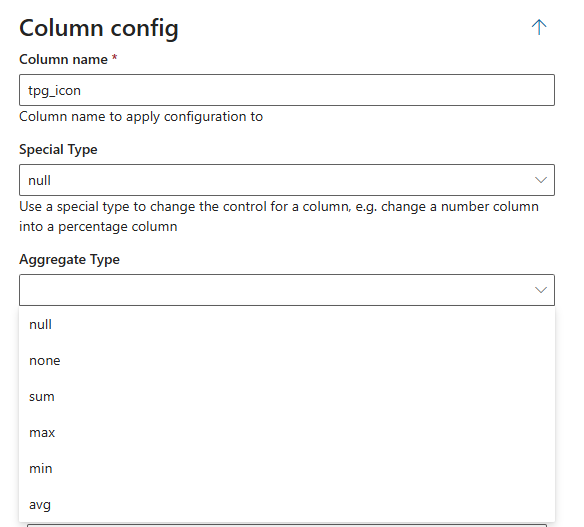
Column Name
➢Enter the technical name of the column to which the configuration should be applied, e.g., tpg_icon.
Special Type
➢Use a special column type to customize the column’s input or display, e.g., display a numeric field as a percentage.
➢Select the desired column type from the drop-down menu.
Aggregate Type
Defines the calculation for summary rows.
➢Select the desired unit from the drop-down menu.
The following options are available for numeric and currency fields:
▪sum: Sum of all values
▪max: Largest value
▪min: Smallest value
▪avg: Average value
▪none: No calculation
Column Properties
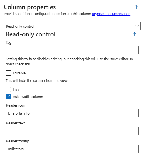
This option allows you to define additional properties for a column.
▶ For more information on the available options, see the relevant Bryntum Documentation.
▪Read-only Control: Controls whether the values in the column can be edited.
▪Editable checkbox unchecked: Editing is disabled.
▪Editable checkbox checked: Editing is allowed.
▶ Leave this checkbox unchecked. Only then will editing remain disabled.
▪Column Visibility: This option allows you to hide a column from view.
▪Hide checkbox unchecked: The column is visible.
▪Hide checkbox checked: The column is hidden.
▶ Hidden columns are not displayed to users.
▪Header icon: Defines an icon that appears in the column header.
▪Style Tag: b-fa-[iconName]
▪Example: b-fa b-fa-info
▶ This is useful, for example, for highlighting additional information or special features. You can find free icons to use as indicators at Font Awesome.
▪Header text: Sets the name displayed for the column.
▪Header tooltip: Defines the help text that appears when you hover over the column header with the mouse.
▶ Use tooltips to provide users with additional information or hints about the column.
Indicators
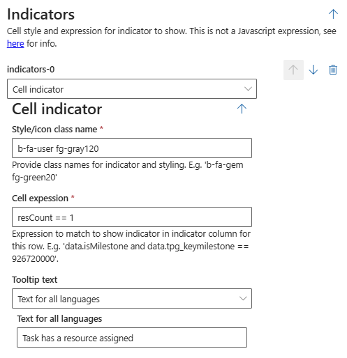
Indicators allow you to visually highlight cells based on defined conditions, for example, with an icon or color formatting.
For each indicator, you specify which style to use and under what conditions the indicator is displayed.
▶ The condition is not defined as a JavaScript expression. For information on valid syntax, see the relevant documentation here.
➢Style/icon class name: Defines the icon and formatting of the indicator.
Example: b-fa-user fg-gray120.
➢Cell expression: Specifies the condition under which the indicator is displayed in the respective row.
Example: resCount == 1.
➢Tooltip-text: Defines the text displayed as a tooltip for the indicator.
➢Use the dropdown menu to specify whether the text applies to all languages (Text for all languages) or to a specific language (Text language specific).
Additional editing options:

➢Click the Delete icon to delete a field. (1)
➢Click the up or down arrow to expand or collapse the desired column configuration. (2)
➢Click Add Item to add a field. (3)
Complete the configuration:
➢Click Submit at the very bottom to apply the settings.